After 19 years of working for the Columbus Crew, the three construction workers who represented the Major League Soccer franchise’s logo were laid off Oct 8.
Anthony Precourt, the Columbus Crew SC Chairman and Investor-Operator, unveiled a new, construction-worker free logo at the #NEWCREW revealing party at the Lifestyle Community Pavilion.
Austin Jones, one of the 1,500 soccer fans who attended the rebranding event, said the makeover was overdue. “I think the new logo’s pretty cool. I like how they incorporated everything over the last (19) years,” Jones said. “I liked the old logo with the shield but I thought it needed some updating. I like the new one better.”
Jones is not alone. USA-Today writer Nick Schwartz said the Crew’s updated look “is now the best in the MLS.”
The current look corrects some of the rather egregious omissions from the previous logo.
Firstly, the three construction workers didn’t have anything to do with soccer nor was soccer mentioned anywhere on the logo. Secondly the old logo didn’t mention the city or have anything to do with Columbus (except for the Capital City’s apparent affinity for highway construction projects). Finally the old logo could have easily been mistaken for a Men at Work CD cover.
When the Crew was designing the new logo, Precourt said it was looking for something its entire fan base could get behind.
“We’re changing something that has been around for 19 years and something we hope we don’t change again. My highest priority coming in, besides the soccer and getting back to winning ways on the field, was to become more relevant as a brand,” Precourt said. “We just did a lot of thinking about ‘What does Columbus stand for?’
“We don’t want to change this again so we wanted it to be timeless. Obviously, our old crest had some retro aspects to it that are sort of endearing, so we want something that has a little bit of retro and some progressive aspects to the new badge.”
As a result of fan surveys, Columbus decided to keep black and gold as the team’s colors. This was a relief to season ticket holder Cheryl Vaia. Vaia attended the rebranding event in a full-length coat, fashioned out of nine Columbus Crew soccer scarves.
Before the unveiling, Vaia said her biggest concern was for the team colors. “I think it’s time for a change but the biggest thing for me is that they don’t change the colors. That would be a disaster,” said Vaia, who has been attending games since 1996 the team’s first season and has been a season ticket holder since the Crew’s second season. “Yellow is a fairly unique color for soccer, so it makes us special.”
“I think black and gold is what we’re all about, so I’m really proud that we stuck with our colors,” Precourt said afterward. “It’s an evolution; it is not a full rebrand.”
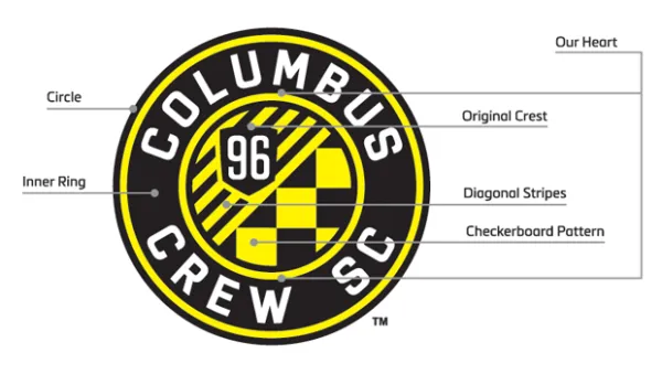
The new badge, which is expected to be fully in place next season, took nearly two years to research and design. It has nods to the state, the past and the future of the team.
THE STATE: The circle within a circle design makes the patch look like the design of Ohio’s state flag. That shows the Crew isn’t just Columbus’ team; it’s the state’s. Columbus is the only city in the state to have an MLS team.
THE PAST: The new logo reminds fans Columbus was the first member of the MLS by adding a large “96,” a reference to the Crew’s first year, in the top portion of the inner circle. Beneath the number are nine yellow and black stripes, representing the nine original teams in the MLS, pointing upward to show Columbus as well as the rest of the league is moving forward.
On the lower portion of the inner central circle, the black and gold checkered flag, a nod to the city’s passionate fan base.
THE FUTURE: The logo also represents a new formal name for Columbus. The formal name of the Crew will be the Columbus Crew Soccer Club or Crew SC (or CCSC for those who are into the whole brevity thing) in the near future.
Gregg Berhalter, the head coach and sporting director of the Crew, believes the new logo represents his team well. With five games to be played, Columbus is currently in fifth place in the Eastern Conference with the top five teams advancing toward the playoffs. “For me this is about more than just a logo. It’s about a culture,” Berhalter said. “Our culture is our style of play. We dictate the play. It doesn’t matter if we’re in New York, L.A. or D.C. We want to dictate the play. We want to bring Columbus to them.”
“I think it needed to evolve and mean something that was more representative of a young, intelligent, progressive city,” Precourt added.
And if that means leaving the three construction workers on the roadside, Jones is fine with that. Asked if he wouldn’t miss the guys in the old logo, Jones just shrugged his shoulders and said “Eh, probably not.”
